


Maturing the Design System for a multi-product B2B agritech platform
design system
Project outcomes
With full design system review, we created consistent and scalable foundation for current and incoming product needs.
4+ products
covered
light mode
enabled
Up to 30%
delivery time saved

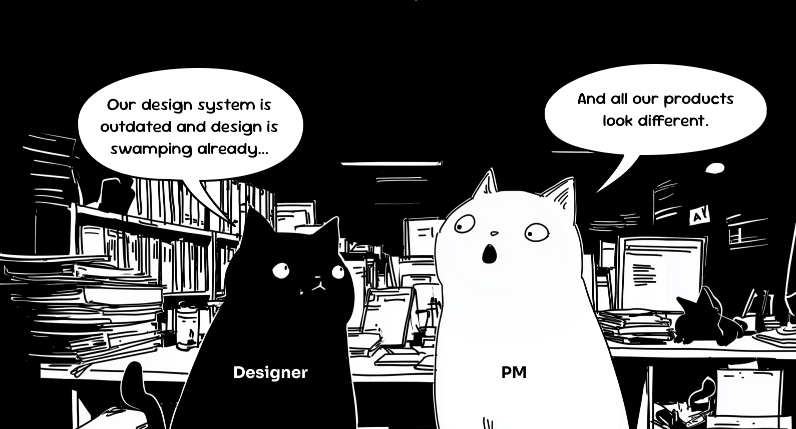
Problem

1
2

3
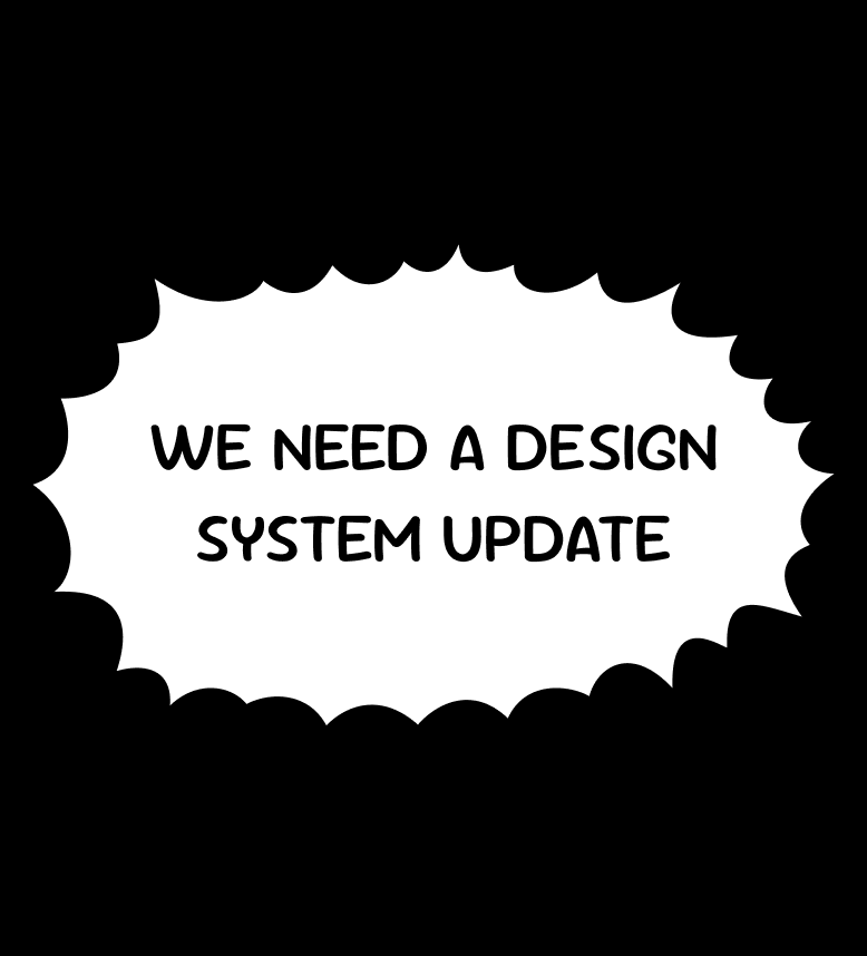
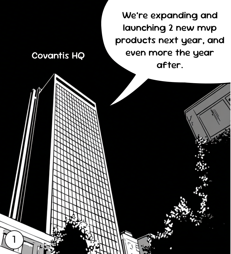
So the challenge was
To align design and development under a single scalable system, improving consistency, team velocity, and readiness for future product launches.
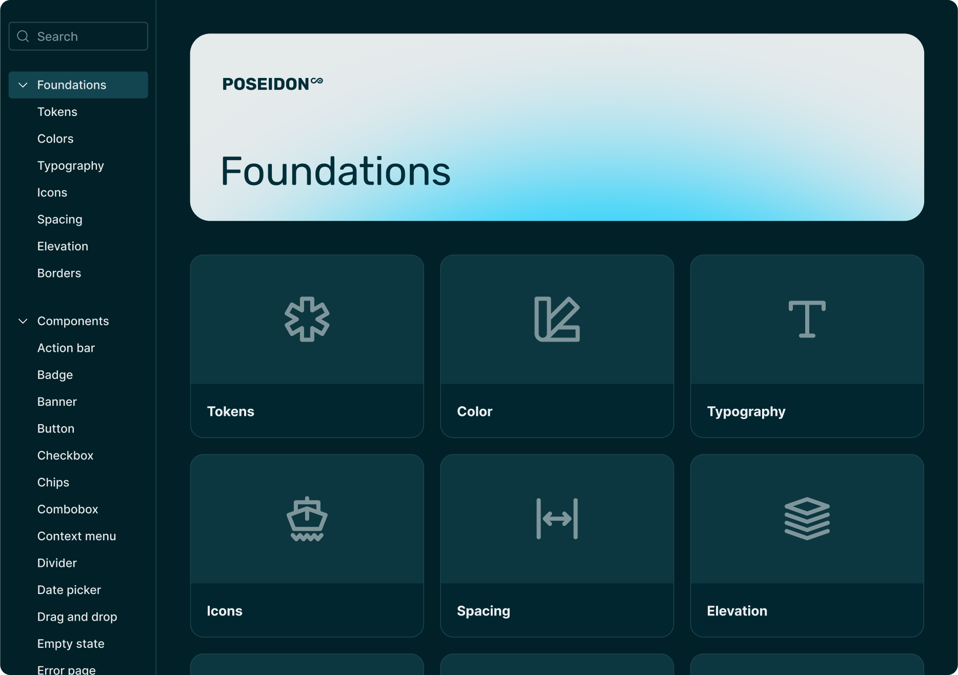
Solution
We built a token-based design foundation with reusable components powering 4+ applications. The system is supported by clear documentation and contribution guidelines, ensuring consistency and scalability across teams.

Research highlights
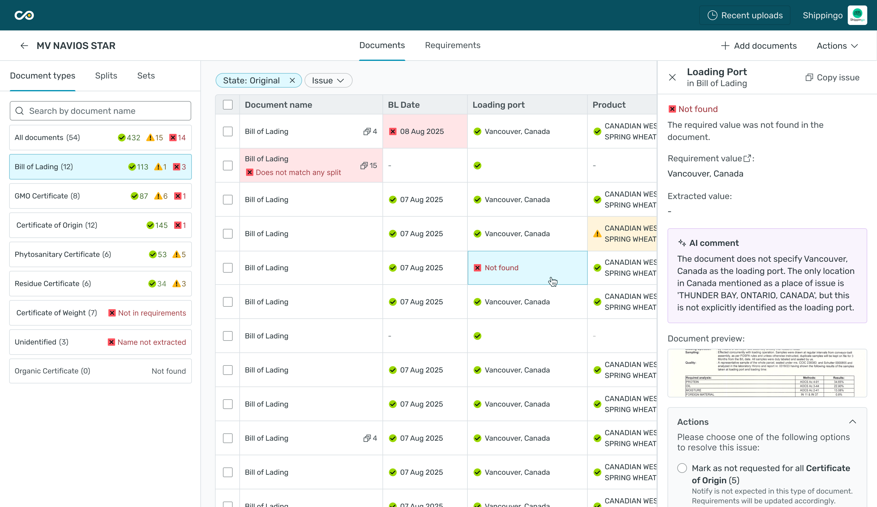
We ran workshops with the Covantis team to uncover what wasn’t working in their current setup, understand design system limitations, and align on goals for the new phase.

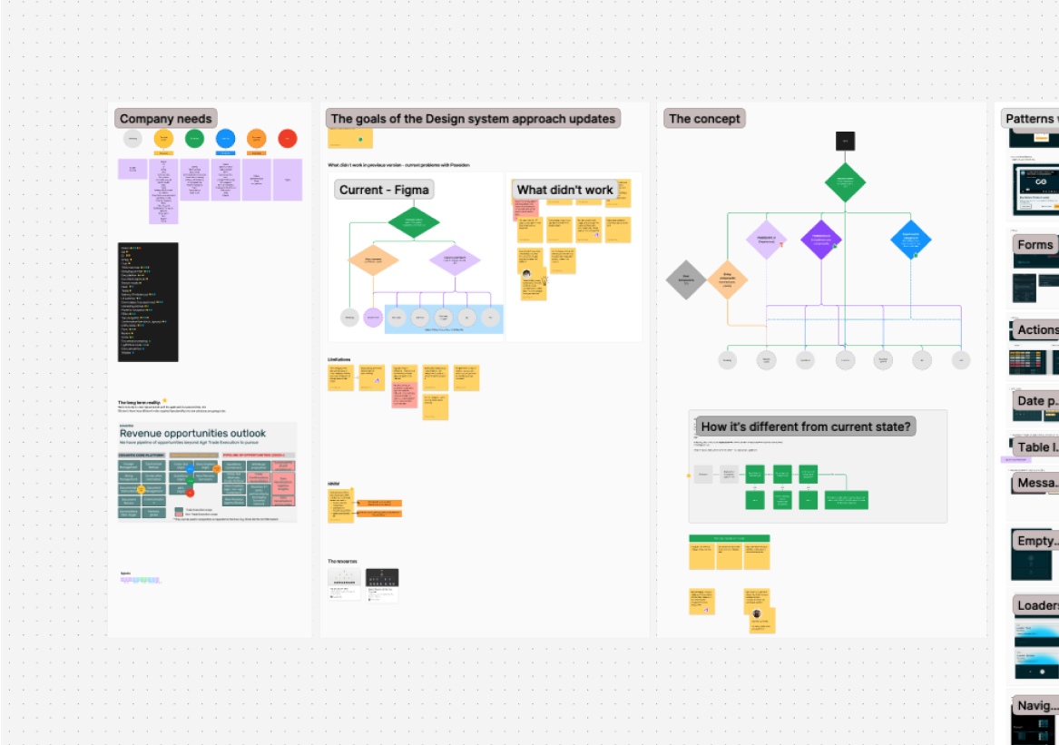
Main issue uncovered
Initial theming approach
The original theming setup assumed a simple, intuitive rule: when switching themes, white becomes black, and black becomes white.
How it worked
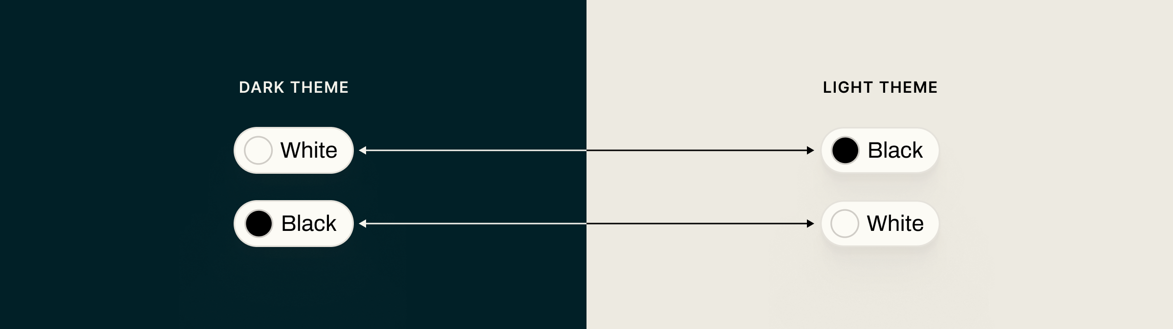
This might be fine for the texts:
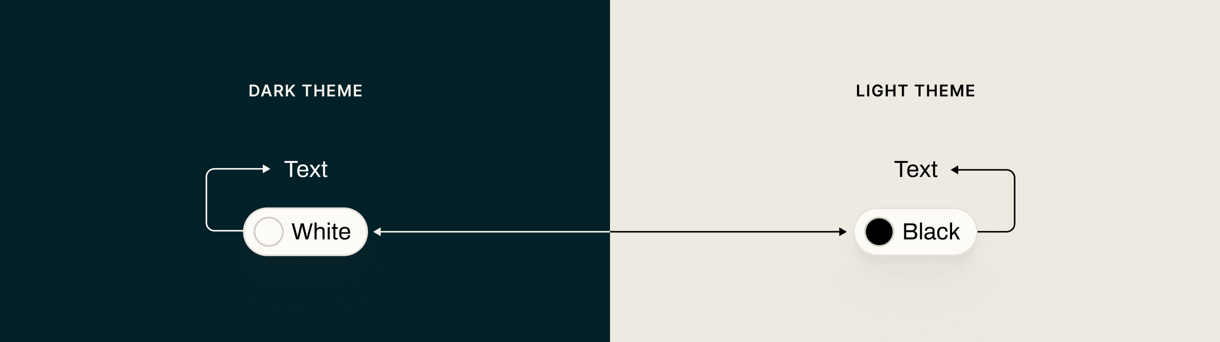
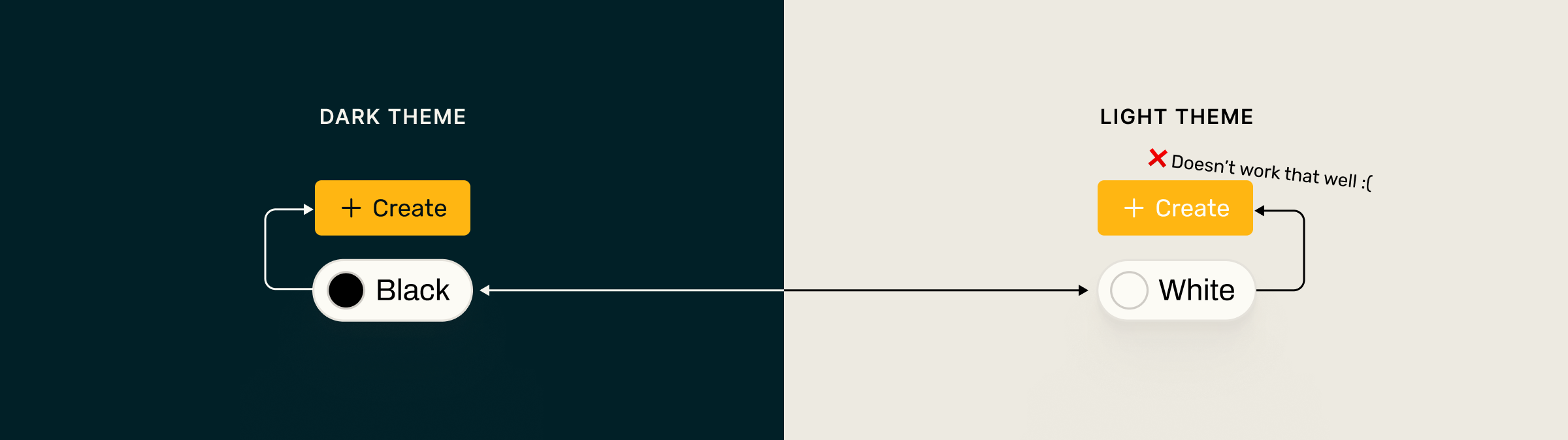
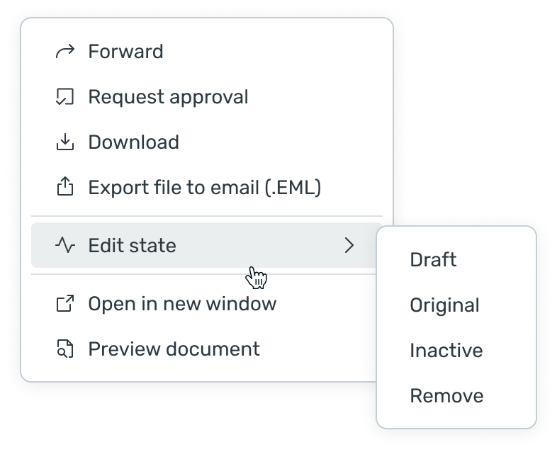
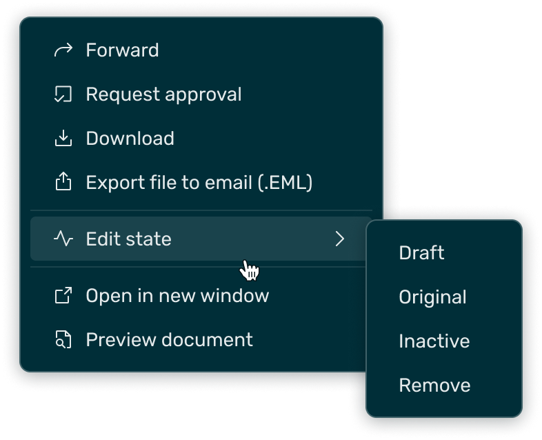
but it may break when it comes with other components and contexts:
Solution
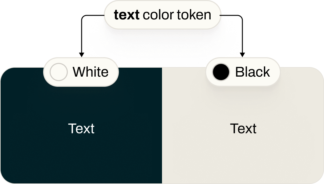
Fixing tokens
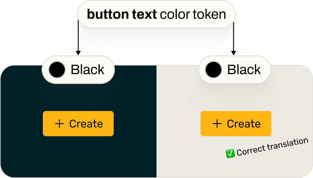
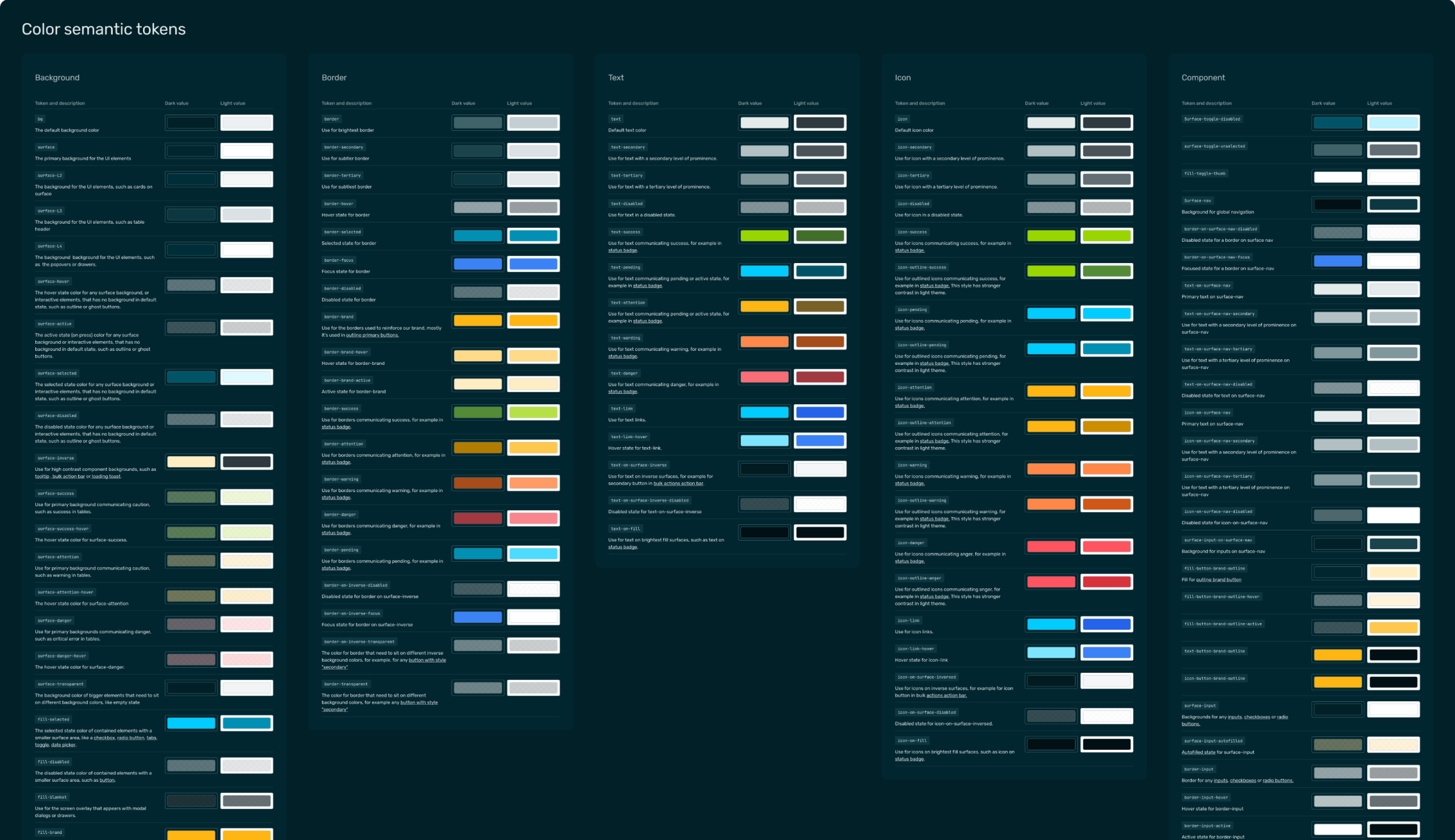
To fix this, we introduced a layer of semantic tokens. These define colors by their purpose — for example, a “text color” or “button text color” token — each with appropriate color references for light and dark themes.
tokens mapping example
Introducing semantic tokens stopped the “invert colors” rule, which had been producing incorrect results.
Before - incorrect color swapping
After
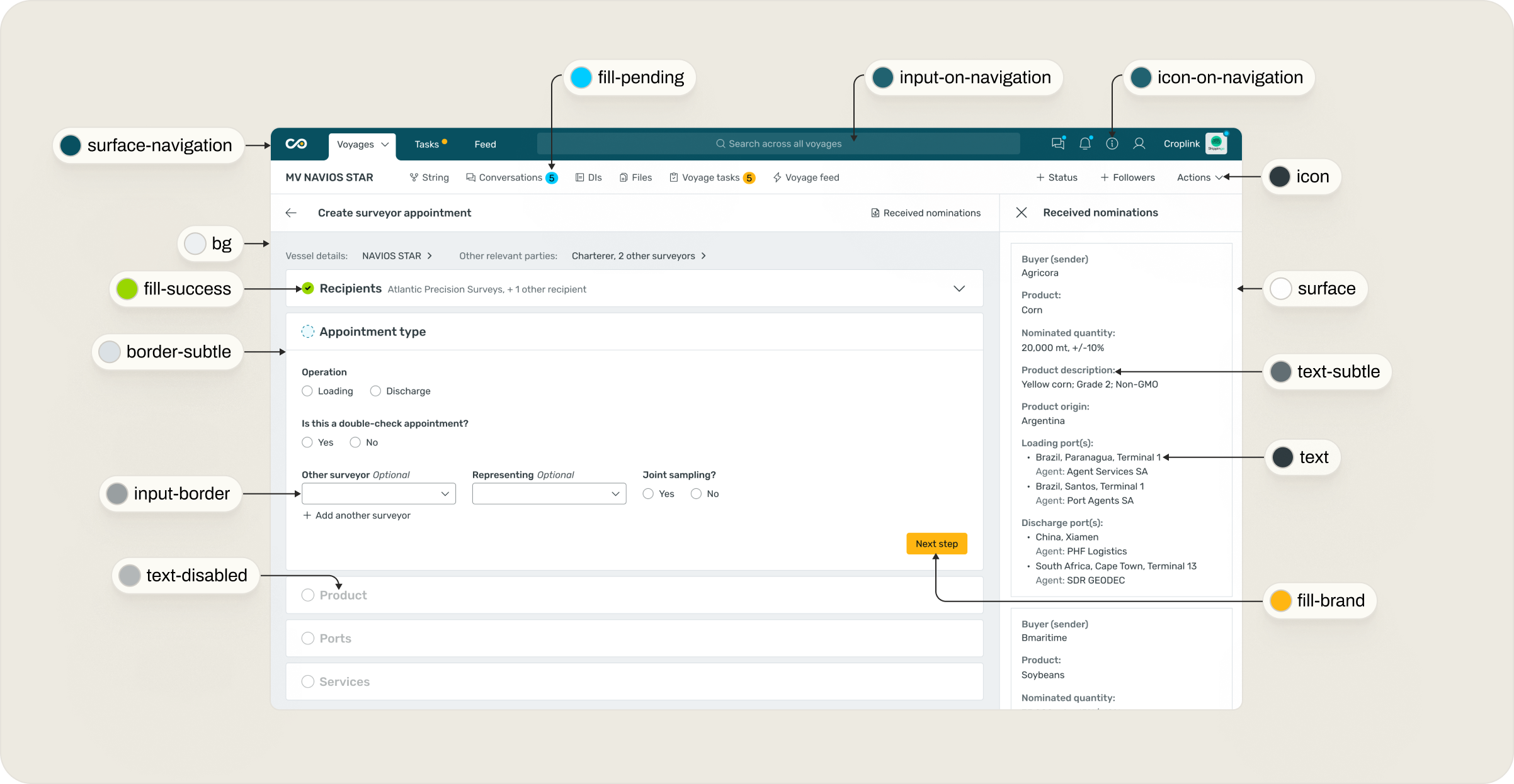
To make theme behavior transparent, we documented every semantic token — defining its light and dark values and showing real examples of how each is used in components.
This turned the design system into a convenient, automated theme-switching setup that anyone on the team could confidently rely on — without guesswork.
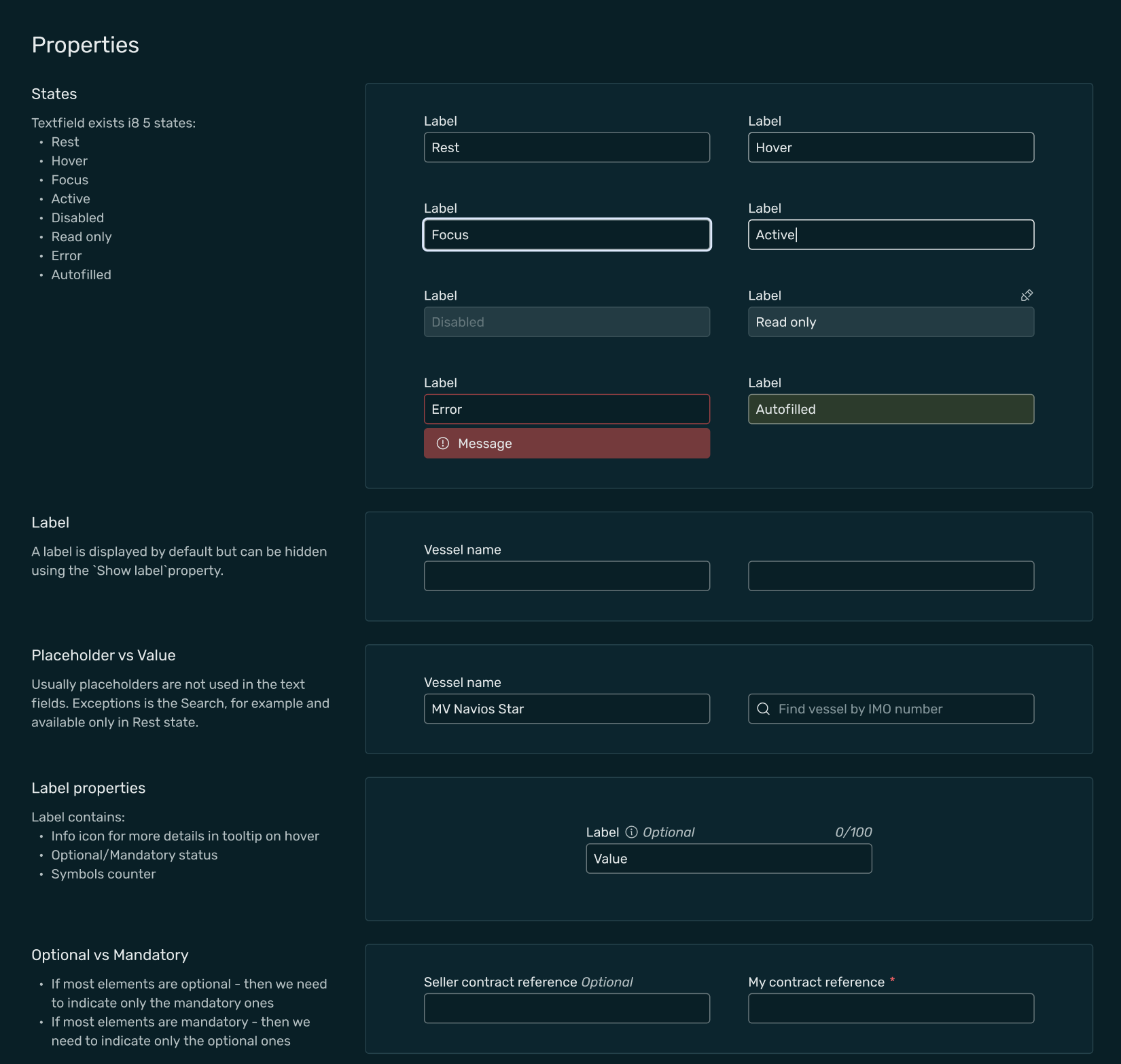
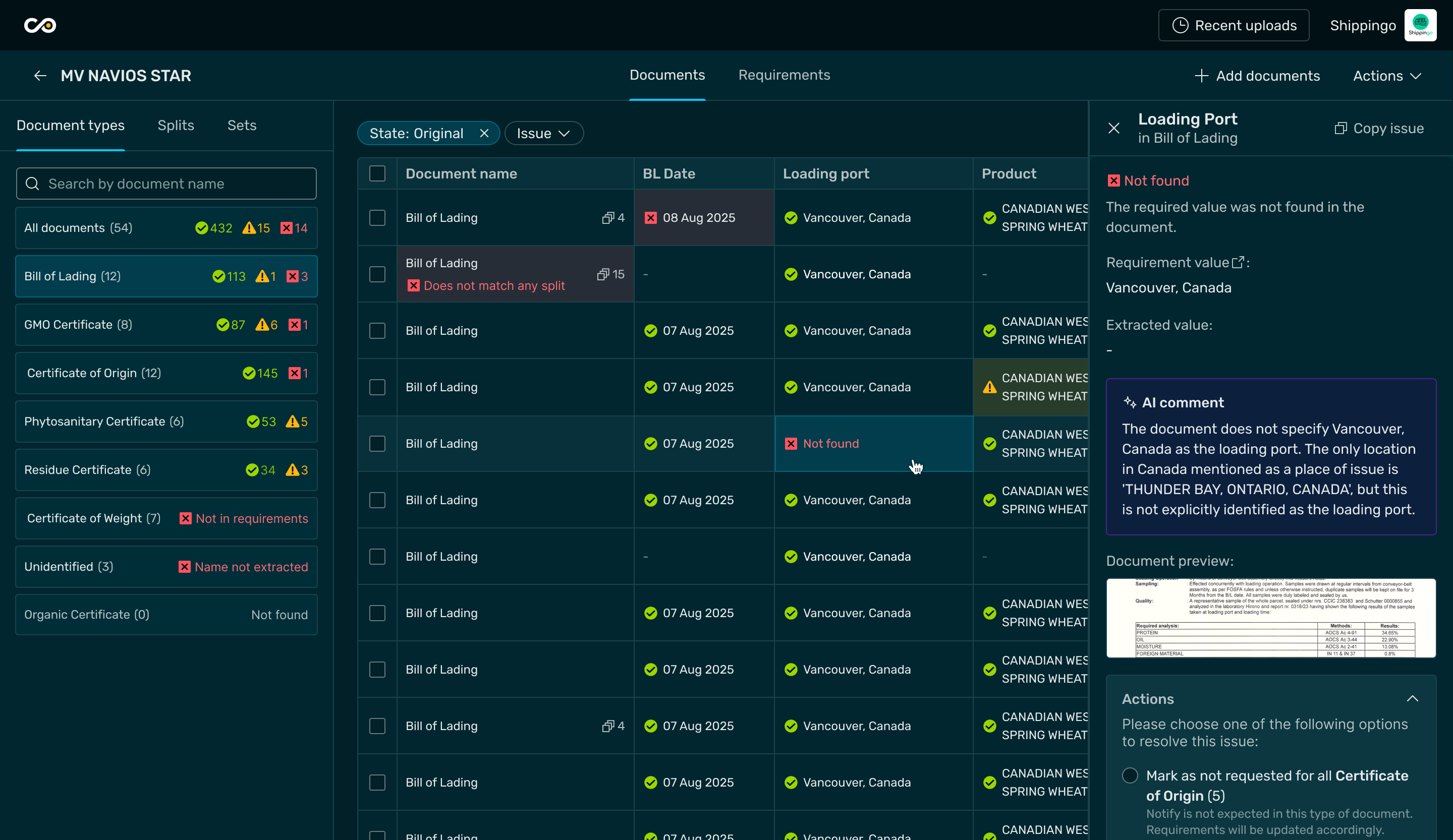
Components
During the initial library audit, we reviewed 75 components across multiple apps, identified patterns used in three or more products, and curated a refined set of 35 components to form a solid foundation for future growth.

Each of these components was then aligned with the new semantic tokens, ensuring consistent behavior and correct theming across light and dark modes.
Each component comes with detailed documentation that covers all its configurations, variations, and behaviors - making it easy for teams to use and adapt.
Configurable components in figma
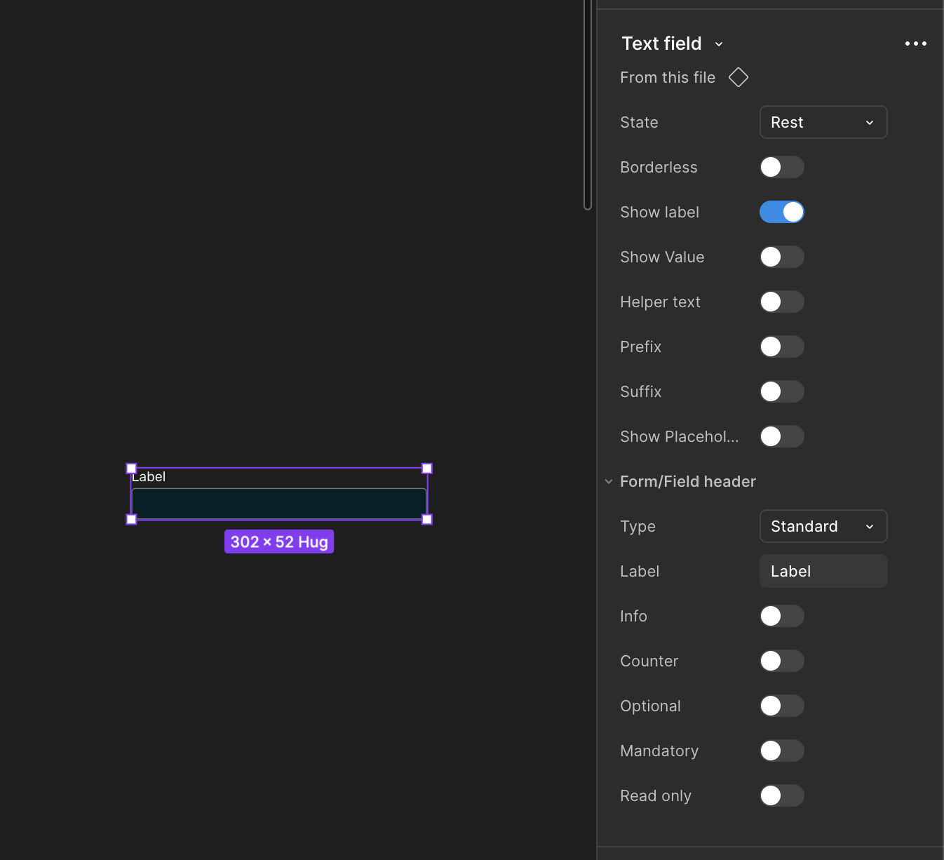
Detailed documentation
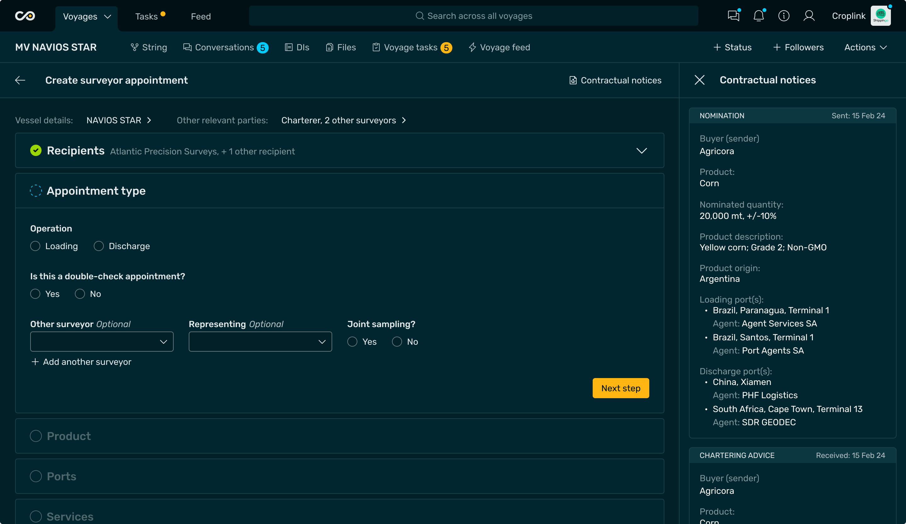
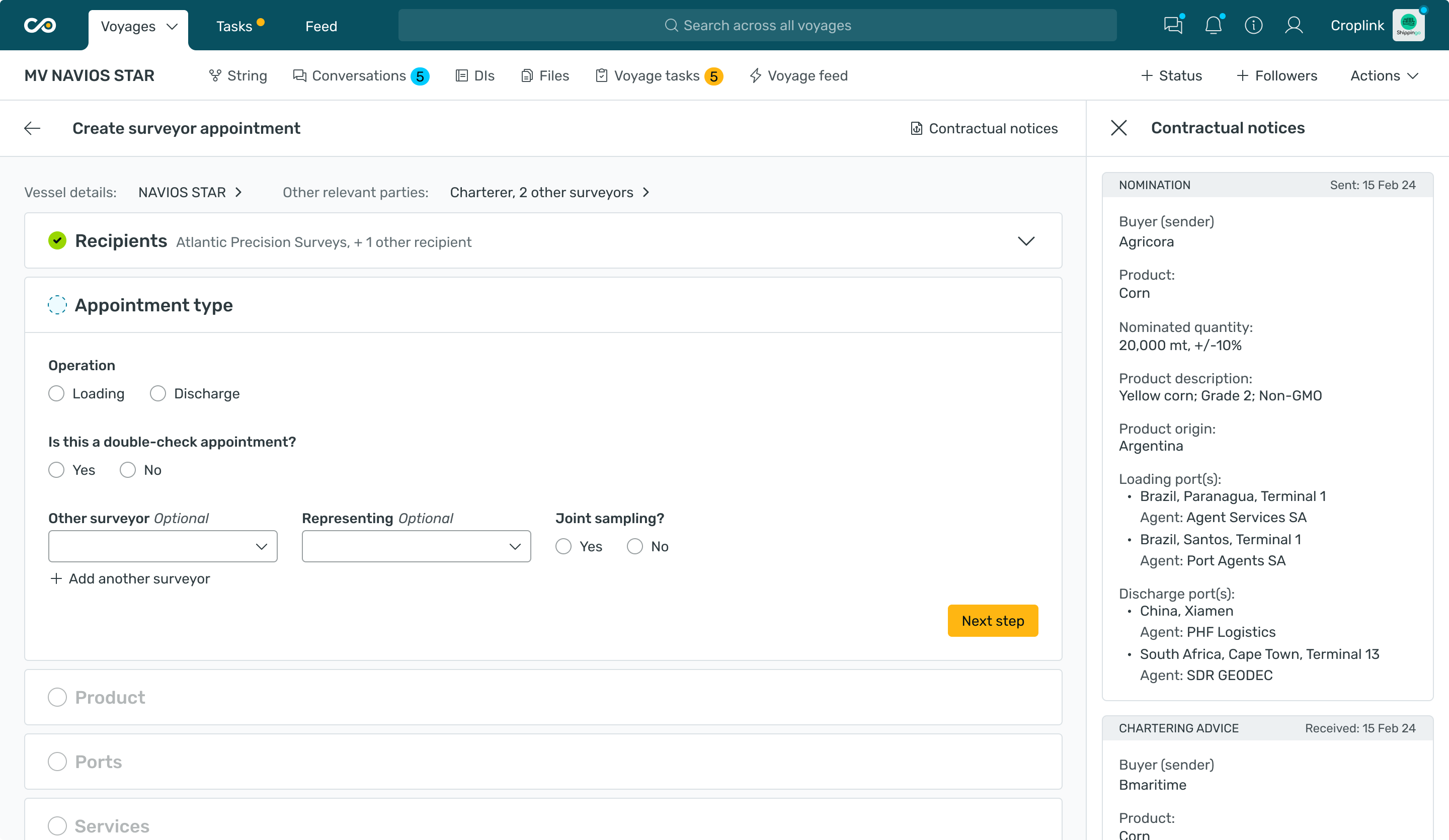
System adoption
The Poseidon 2.0 design system is now live, bringing consistency and a shared visual language across all Covantis products, and is fully prepared to support future growth.


Let’s work together
Your B2B SaaS design boutique
We're always here to chat
hello@mumblejam.com
Follow us


All rights reserved 2025
Maturing the Design System for a multi-product B2B agritech platform
design system
Project outcomes
With full design system review, we created consistent and scalable foundation for current and incoming product needs.
4+ products
covered
light mode
enabled
Up to 30%
delivery time saved
Problem
3
So the challenge was
To align design and development under a single scalable system, improving consistency, team velocity, and readiness for future product launches.
Solution
We built a token-based design foundation with reusable components powering 4+ applications. The system is supported by clear documentation and contribution guidelines, ensuring consistency and scalability across teams.
Research highlights
We ran workshops with the Covantis team to uncover what wasn’t working in their current setup, understand design system limitations, and align on goals for the new phase.
Main issue uncovered
Initial theming approach
The original theming setup assumed a simple, intuitive rule: when switching themes, white becomes black, and black becomes white.
How it worked
This might be fine for the texts:
but it may break when it comes with other components and contexts:
Solution
Fixing tokens
To fix this, we introduced a layer of semantic tokens. These define colors by their purpose — for example, a “text color” or “button text color” token — each with appropriate color references for light and dark themes.
tokens mapping example
Introducing semantic tokens stopped the “invert colors” rule, which had been producing incorrect results.
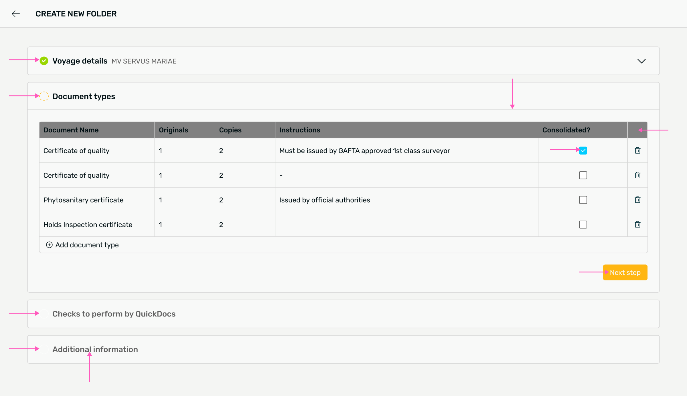
Before - incorrect color swapping
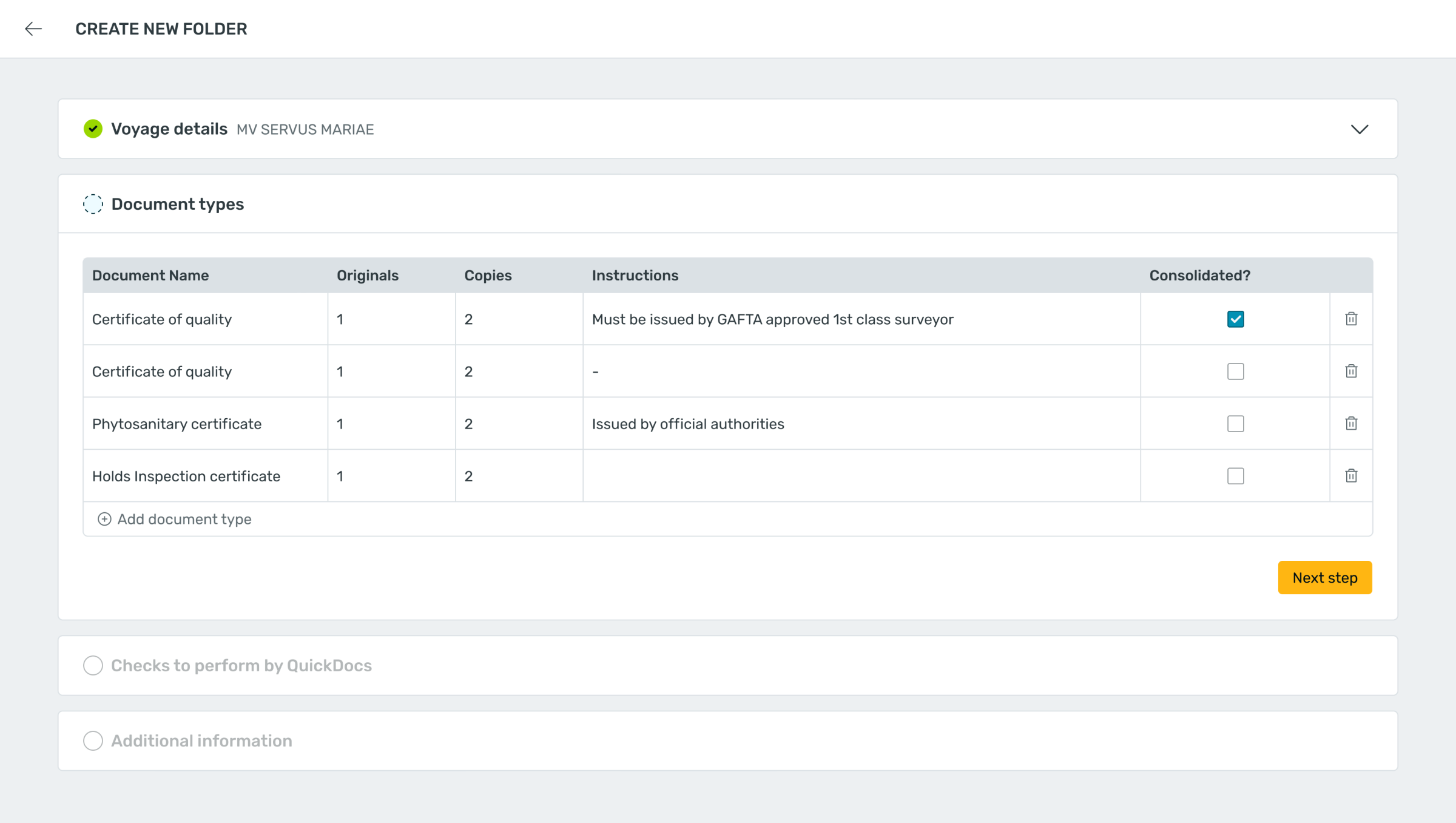
After
To make theme behavior transparent, we documented every semantic token — defining its light and dark values and showing real examples of how each is used in components.
This turned the design system into a convenient, automated theme-switching setup that anyone on the team could confidently rely on — without guesswork.
Components
During the initial library audit, we reviewed 75 components across multiple apps, identified patterns used in three or more products, and curated a refined set of 35 components to form a solid foundation for future growth.
Each of these components was then aligned with the new semantic tokens, ensuring consistent behavior and correct theming across light and dark modes.
Each component comes with detailed documentation that covers all its configurations, variations, and behaviors - making it easy for teams to use and adapt.
Configurable components in figma
Detailed documentation
System adoption
The Poseidon 2.0 design system is now live, bringing consistency and a shared visual language across all Covantis products, and is fully prepared to support future growth.
Let’s work together
Your B2B SaaS design boutique
We're always here to chat
hello@mumblejam.com
Follow us
All rights reserved 2025
Maturing the Design System for a multi-product B2B agritech platform
design system
Project outcomes
With full design system review, we created consistent and scalable foundation for current and incoming product needs.
4+ products
covered
light mode
enabled
Up to 30%
delivery time saved
Problem
1
2
3
4
So the challenge was
To align design and development under a single scalable system, improving consistency, team velocity, and readiness for future product launches.
Solution
We built a token-based design foundation with reusable components powering 4+ applications. The system is supported by clear documentation and contribution guidelines, ensuring consistency and scalability across teams.
Research highlights
We ran workshops with the Covantis team to uncover what wasn’t working in their current setup, understand design system limitations, and align on goals for the new phase.
Main issue uncovered
Initial theming approach
The original theming setup assumed a simple, intuitive rule: when switching themes, white becomes black, and black becomes white.
How it worked
This might be fine for the texts:
but it may break when it comes with other components and contexts:
Solution
Fixing tokens
To fix this, we introduced a layer of semantic tokens. These define colors by their purpose — for example, a “text color” or “button text color” token — each with appropriate color references for light and dark themes.
tokens mapping example
Introducing semantic tokens stopped the “invert colors” rule, which had been producing incorrect results.
Before - incorrect color swapping
After
To make theme behavior transparent, we documented every semantic token — defining its light and dark values and showing real examples of how each is used in components.
This turned the design system into a convenient, automated theme-switching setup that anyone on the team could confidently rely on — without guesswork.
Components
During the initial library audit, we reviewed 75 components across multiple apps, identified patterns used in three or more products, and curated a refined set of 35 components to form a solid foundation for future growth.
Each of these components was then aligned with the new semantic tokens, ensuring consistent behavior and correct theming across light and dark modes.
Each component comes with detailed documentation that covers all its configurations, variations, and behaviors - making it easy for teams to use and adapt.
Configurable components in figma
Detailed documentation
System adoption
The Poseidon 2.0 design system is now live, bringing consistency and a shared visual language across all Covantis products, and is fully prepared to support future growth.
Let’s work together
All rights reserved 2025